OpenFoodFacts
Exploring Global Food Quality Patterns through a Visual Dashboard
I built an interactive dashboard using Dash library to explore the OpenFoodFacts dataset, which contains nutritional information about food products from around the world. This open-source database includes details on ingredients, nutritional content, additives, processing levels, and quality scores for products across different countries.
The OpenFoodFacts data includes various nutritional metrics, with key variables including:
- Nutrition grade (A-E scale, with A being healthiest)
- NOVA group (1-4 scale of processing level, with 1 being least processed)
- Nutritional content (fat, sugar, salt, protein, carbohydrates)
- Additives count
- Country of origin
- How does food processing level (NOVA classification) relate to nutritional quality across different countries?
- Is there a relationship between a country's economic development (GDP per capita) and the nutritional quality of its food products?
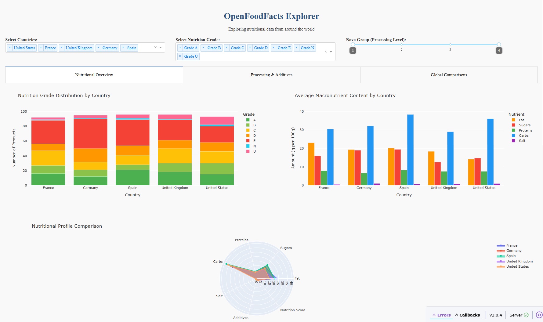
- Visualization 1: Nutrition Grade Distribution by Country The visualization immediately revealed interesting patterns:
- France has a higher proportion of Grade A products compared to other countries
- The United States has more Grade D and E products
- Germany shows a relatively balanced distribution
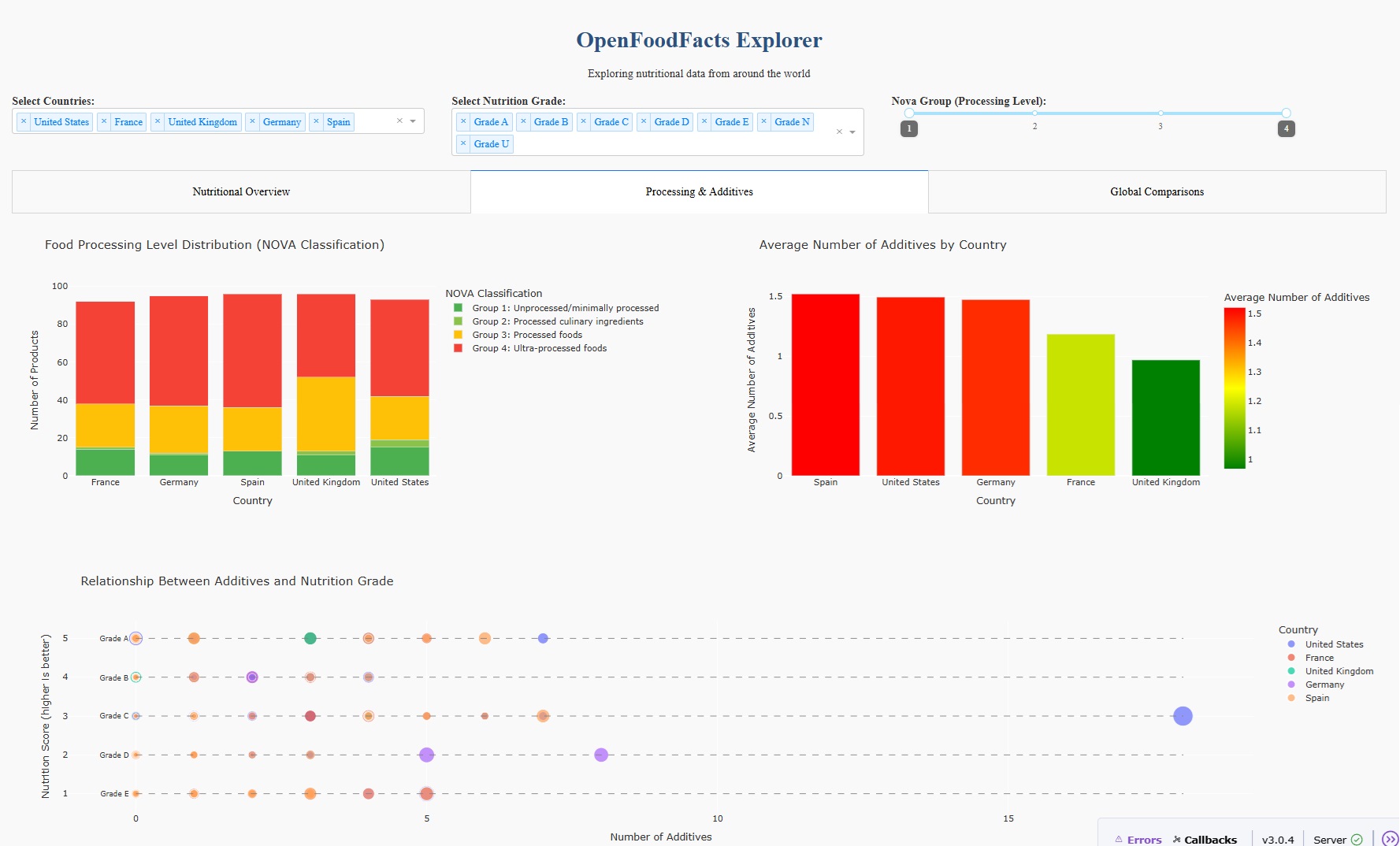
- Visualization 2: Food Processing Level Distribution (NOVA Classification) This visualization revealed:
- Countries with better nutrition grades tend to have more Group 1 and 2 products
- The United States has the highest proportion of ultra-processed (Group 4) foods
- This aligns with the nutrition grade findings and suggests processing level could be a key factor in overall food quality
- Visualization 3: Average Macronutrient Content by Country Key observations:
- Countries with higher nutrition grades generally have lower sugar and salt content
- Protein content varies less dramatically across countries
- The United States and United Kingdom products show higher fat content on average
- Visualization 4: Relationship Between Additives and Nutrition Score The visualization revealed:
- A negative correlation between additives count and nutrition score (more additives = lower nutrition quality)
- Clear clustering of countries, with some having consistently higher additive counts
- Products with the highest number of ingredients often have more additives
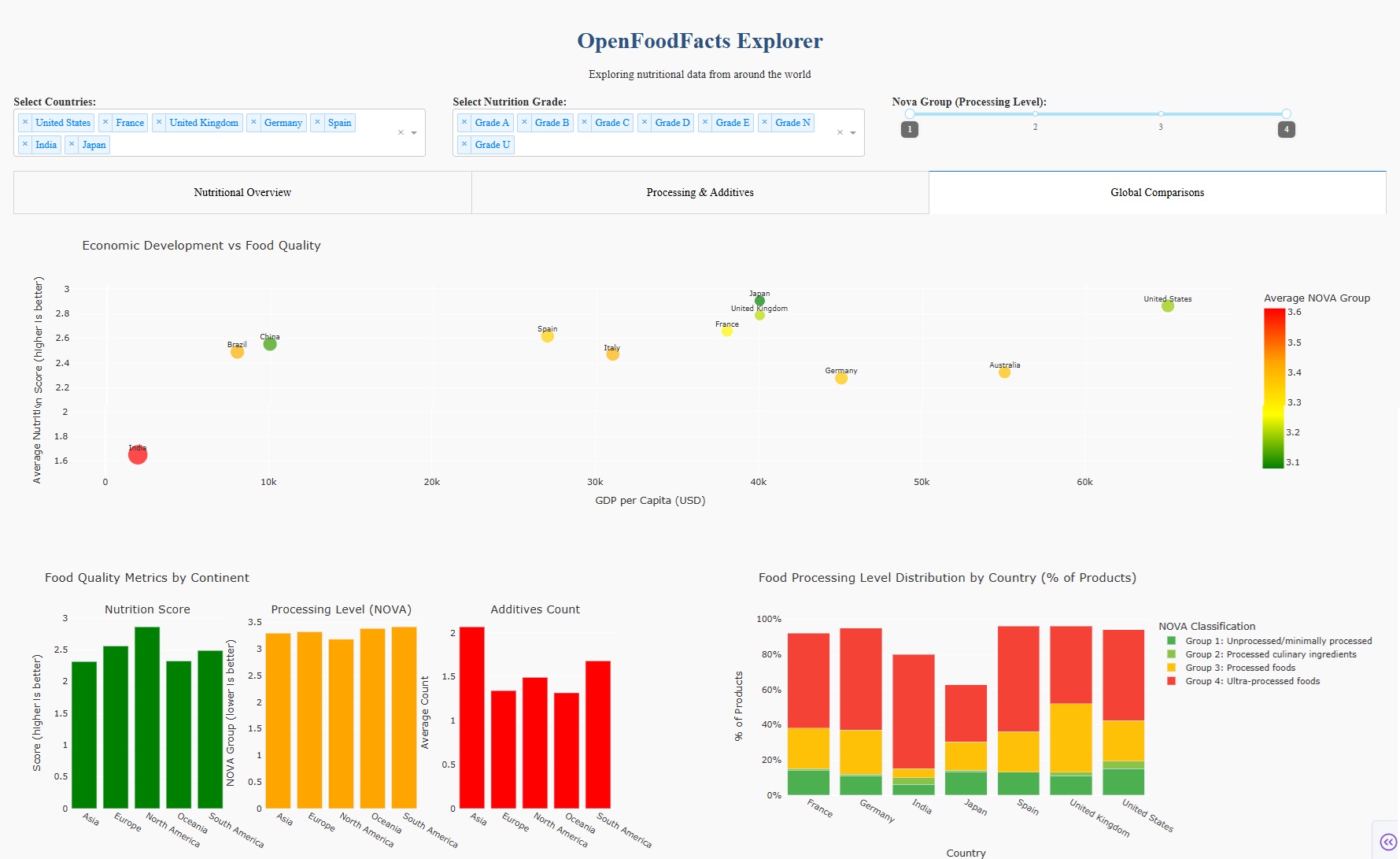
- Visualization 5: Economic Development vs Food Quality This visualization provided fascinating insights:
- Higher GDP countries don't necessarily have better nutrition scores
- There appears to be an inverted U-relationship: middle-income countries often have the highest nutrition scores
- Lower GDP countries tend to have fewer additives but middle NOVA groups
- The highest GDP countries have more additives and higher processing levels
- Visualization 6: Processing Level Distribution by Country The findings were striking:
- Countries like France and Italy have significantly higher percentages of Group 1 and 2 foods
- The United States and United Kingdom have over 60% of products in the ultra-processed Group 4 category
- This visualization clearly demonstrates that food systems in different countries prioritize different levels of processing, which directly impacts nutritional quality


VISUALIZATIONS
Theories of Data Visualization
In the OpenFoodFacts Explorer project, several fundamental theories and principles of data visualization were carefully applied to maximize the effectiveness of the visualizations. These principles guided design decisions and enhanced the communicative power of the analysis. 1. Gestalt Principles 2. Pre-attentive Processing 3. Color Theory 4. Tufte's Principle 5. Shneiderman's Mantra: "Overview first, zoom and filter, then details-on-demand" 6. Bertin's Visual Variables 7. Cognitive Load Theory 8. Cleveland and McGill's Graphical Perception